

Starting in March 2020, the Yu Group at UC Berkeley Statistics / EECS / CCB worked to help forecast the severity of the epidemic for individual counties and hospitals in the US. We developed interpretable models (updated daily until May 2021) and curated data to predict the trajectory of COVID-19-related deaths. This website provides an archive of that project. We collaborated with Response4Life to blunt the effect of COVID-19 through the production and appropriate distribution of PPE, medical equipment, and medical personnel to healthcare facilities across the United States.
We also provided hospital-level predictions via a now-retired website where one could upload data for a specific hospital and download prediction results for the given hospital. The uploaded data waqs only be temporarily used for prediction and was never collected.
visualizations

This feature is now archived. Hospitals were able to upload hospitalization data and get 14 day prediction results. The uploaded data was only be temporarily used for prediction and was not be stored in any form.

COVID pandemic severity index (CPSI): this index was designed to help aid the distribution of medical resources to hospitals. It takes on three values (3: High, 2: Medium, 1: Low), indicating the severity of the covid-19 outbreak for a hospital on a certain day. It was calculated in three steps; the index is no longer updated, but you can find more details here and here.
Data
We have compiled and cleaned a large corpus of county-level and hospital-level data up to May 14, 2021 from a variety of public sources to aid data science efforts to combat COVID-19. At the county level, our data include COVID-19 cases/deaths from USA Facts and NYT, automatically updated every day, along with demographic information, health resource availability, COVID-19 health risk factors, and social mobility information. At the hospital level, our data include the location of the hospital, the number of ICU beds, the total number of employees, and the hospital type.
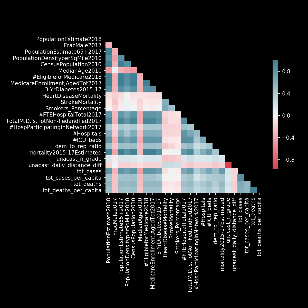 Feature correlations: This heatmap shows correlations between some of the features we have collected at the county-level.
models

Combined Linear and Exponential Predictors (CLEP)
Calculate a weighted average of the predictions: higher weight to the models with better historical performance
We develop simple, interpretable models for predicting the trajectory of COVID-19-related deaths at the county-level in the United States (updated daily). Our models show that most counties are experiencing exponential growth that can be accurately modeled several days into the future. However, we also find that some counties are starting to experience sub-exponential growth, possibly due to the “flattening-the-curve” impacts of interventions such as social distancing and shelter in place orders. Details are in our paper.
 7-day forecasts for selected counties: Prediction intervals are based on the historical performance of our predictors (narrower for counties where the forecasts were accurate). If we denote err as the largest normalized absolute error for a given county in the past five days, then our prediction interval has the form [prediction * (1 - err), prediction * (1 + err)].
Our team

Thanks to support from AWS and Google.